

CLIENT
COLLABBURO
DISCIPLINES
Identity
Graphic Design
Motion
COLLABBURO is a PR powerhouse under the creative leadership of Natasja Wielandt. With over a decade of experience in the field and specialties in the startup, art, and cultural scenes, she, along with her company, builds the relationship between the brand and the audience.
Natasja has entrusted me with the exciting task of crafting a logo that mirrors her unique vision—an emblem rooted in the very essence of creativity and collaboration.
In crafting this logo, simplicity and cleanliness take center stage, reflecting the streamlined and effective approach that defines COLLABBURO's identity.
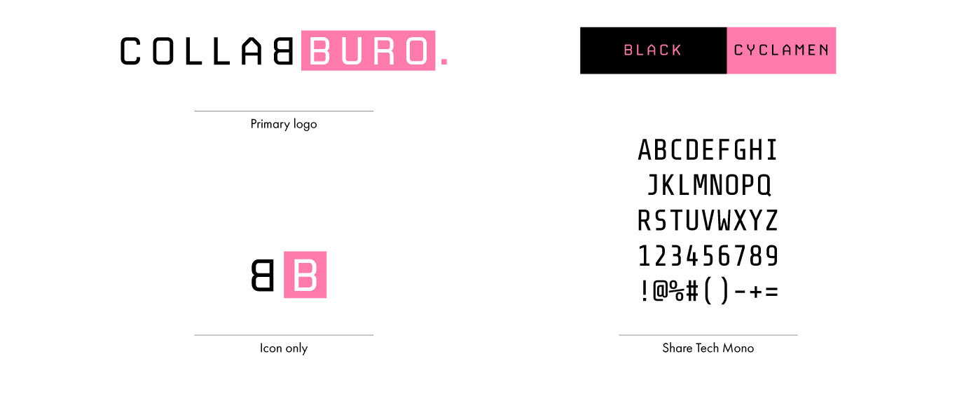
LOGO, COLOURS AND TYPOGRAPHY
For the logo, I curated a modern and clean font, selecting black and pink as the contrasting yet harmonious colors. The dual B's symbolize 'Back to Back,' representing collaboration at its core.
In tandem with the logo type, I opted for an edgy monospace font for the body text, creating a cohesive and contemporary aesthetic that aligns seamlessly with the overall brand identity.
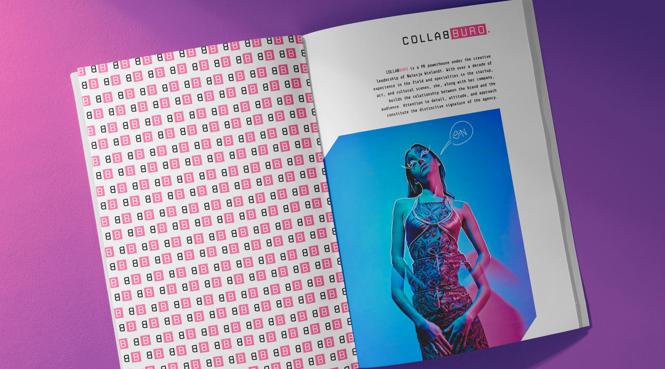
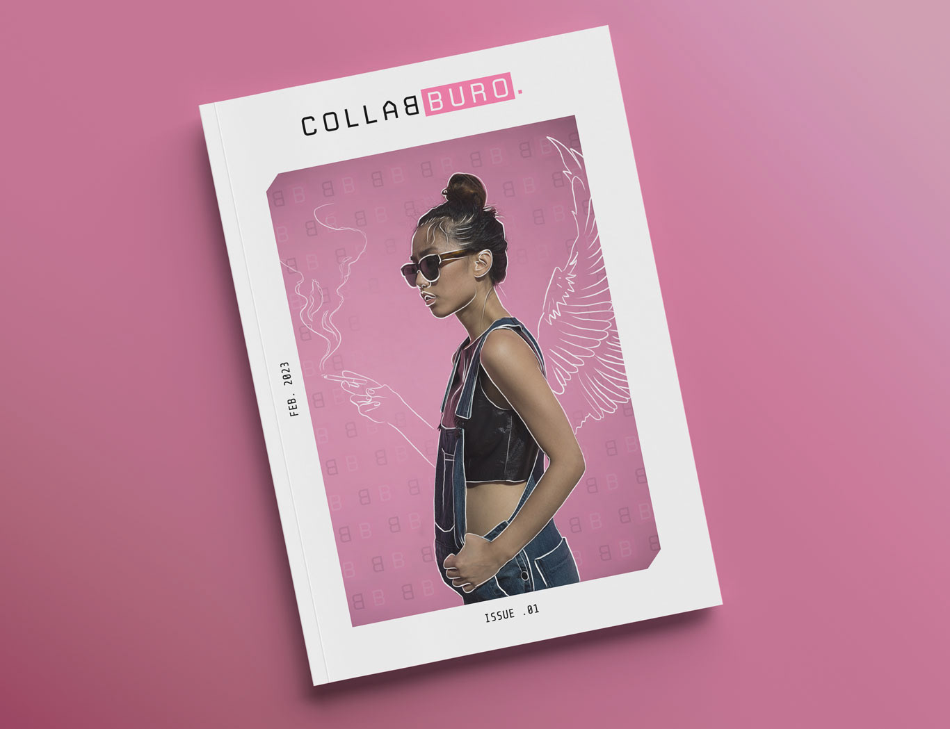
PATTERNS & USE OF PHOTOGRAPHY
The icon pattern serves as a captivating focal point, ideally suited to be a standout feature in a magazine or as show below on the back of the business card.
Photography, consistently cut diagonally, evokes a tangible sense of depth. Furthermore, the application of white scribbles on the photographs embodies an expression of creativity.
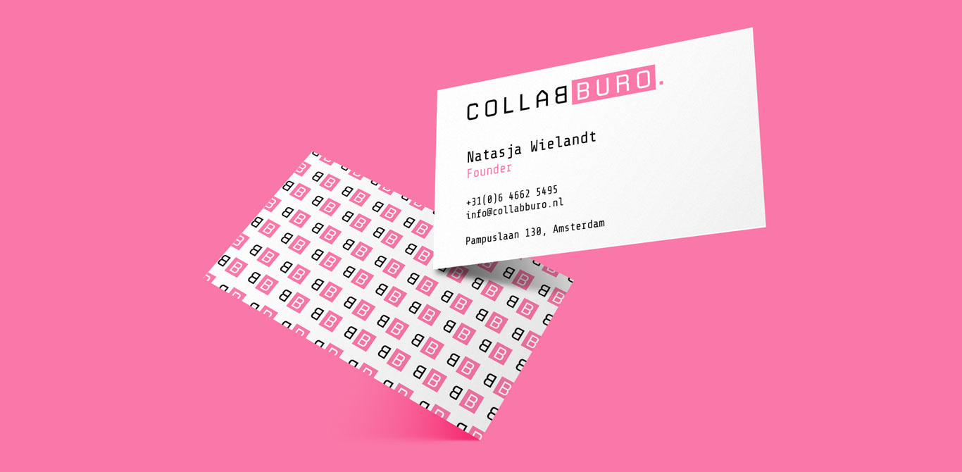
BUSINESS CARD
For the business card, I focused on maintaining a clean and polished front. The body text, however, carries a touch of vibrancy with a subtle pink accent, adding a dash of playfulness to prevent it from being overly formal.
On the back, the pattern takes center stage, infusing the card with a playful and creative flair. This deliberate choice ensures that the business card strikes a balance between professionalism and a dynamic, visually engaging aesthetic.